
Xero • 2026
Manual Journals is one of those deceptively small accounting surfaces that carries a lot of risk. It is used for adjustments, reclasses, accruals, reversals, where accuracy, auditability, and speed all matter at the same time.
The challenge was not to invent a new workflow. It was to redesign a critical legacy experience without breaking the accounting patterns customers already trusted. The work sat at the intersection of UX modernization, technical enablement, regional product fit, and change management.
My role was to help define, challenge and design a modern Manual Journals experience for US small business accountants and bookkeepers. Design requirements included, preserved functional parity, reduced friction for power users, and establishing a safer foundation for future capabilities.
SUMMARY
The legacy Manual Journals experience was creating accountant workflow friction. Accountants and bookkeepers working through high volume, detail sensitive entries were doing so in a UI that felt dated, moved slowly, and sat on a technical foundation that blocked future product work.
The modernization addressed both problems at once: re-platforming the experience onto a modern UI and API foundation while improving clarity, speed, and audit readiness for US customers. The result was a cleaner, faster, more trustworthy workflow that preserved the accounting logic users depended on. Our work established the technical foundation needed to unlock the next layer of product capability, including AI and contacts integration.
THE PROBLEM
The original Manual Journals experience had two overlapping problems.
The product experience was dated and fragmented. The UI sat on an older framework, looked out of step with the rest of Xero, and created unnecessary friction in a workflow where users needed confidence and flow. For accountants working through large batches of journals, the product was not especially fast, keyboard-friendly, or supportive of evidence-based review.
The technical architecture had also become a strategic constraint. Manual Journals was a dependency for future work that included US-critical needs like Contacts on Manual Journals and stronger contact-based reporting. The redesign could not be cosmetic.
This was both a UX problem and an enablement problem:
- •The current experience made high-stakes work harder
- •The legacy stack made improvements slower, riskier, and more expensive
- •US customers had unmet workflow needs in the existing experience
The cost of friction here was not just annoyance. It meant slower month-end close, more avoidable errors, weaker audit trails, and lower confidence in the product.

CUSTOMER JOURNEY
The people most affected by this experience were not casual users. They were time pressured accountants and bookkeepers handling complex journals, adjustments, and recurring entries.
Core jobs:
- •Create: Enter complex journals quickly and accurately, with confidence that the maths is right
- •Verify: Check source evidence while posting or reviewing entries, without leaving the workflow
- •Audit: Revisit journals later with enough context to defend or explain them to a client or auditor
- •Repeat: Manage recurring workflows without carrying repetitive setup overhead every time
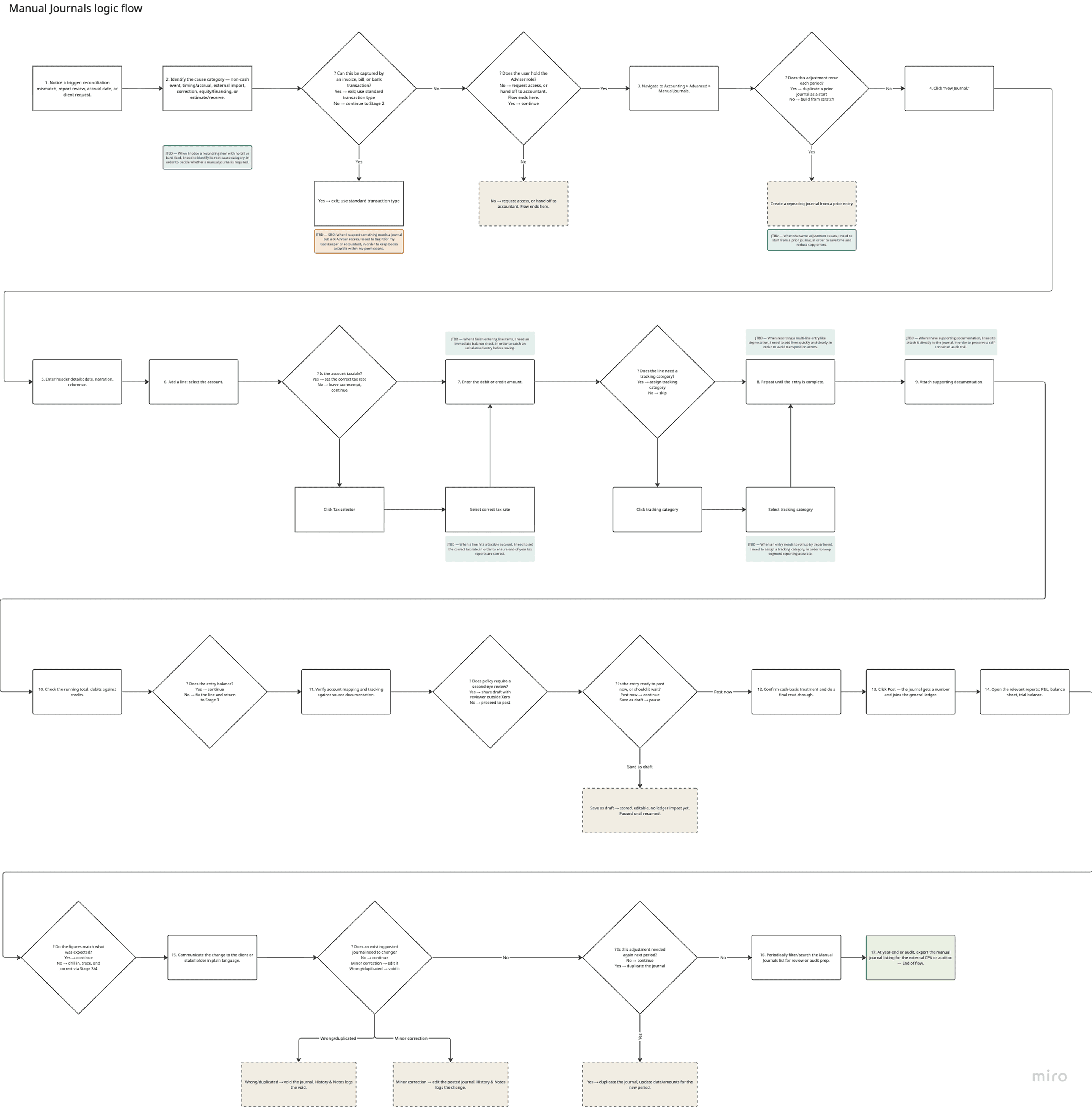
We shifted from treating Manual Journals as simple data entry to designing them as a review environment. Because accountants need to reference source documents and justify decisions over time, the workflow must support the full lifecycle of a journal, including audits. The legacy flat layout failed by fragmenting notes and files.

DESIGN APPROACH
I approached the work with four principles: Start with jobs, not screens. Rather than treating the task as "update the UI," I framed it around what users were actually trying to accomplish. That shifted focus away from surface polish and toward trust, speed, and audit readiness. Separate parity from progress. A major design-thinking move was getting clear on table stakes versus what genuinely needed improvement. Posting and validation logic, existing journal workflows, permissions, and reporting behavior were all non-negotiable. I focused on implementing industry terminology, faster entry patterns, stronger audit context, and user-level defaults. We were not changing the accounting model or conventional interaction flows. We were improving the task flow. Design for power users, not idealized users. The design goal was to remove friction and retain familiar workflows. That meant optimizing for keyboard-first navigation, low-friction row entry, always-visible totals, and fewer visual hurdles when checking evidence. Treat regionalization as product design. Seizing the opportunity to improve US product fit, learnability, and task completion. Instead of cosmetic changes, we aligned the product with expected US accounting workflows through structural language and functional enhancements:
- •Clearer Terminology: Renamed "Narration" to "Journal title" to clarify the field and unify language across lists, reports, and exports.
- •Contextual Defaults: Surface-level settings like tax treatment defaults and "Show journal on cash basis reports" were exposed to reflect actual US practices.
Ultimately, this shift delivered a familiar, intuitive US customer experience by prioritizing workflow-driven language, defaults, and behaviors over basic visual design.
CUSTOMER RESEARCH
I conducted user research and usability studies with product and research. I also gathered valuable outcomes from other product modernization releases that didn't go so well. The legacy journals CSAT benchmarked at 3/5. I iterated and tested and refined the design with existing behavioral data, CX tickets, and moderated customer testing. Our pre-release limited deploy testing resulted in a CSAT score of 4/5 and 15 US accountant and bookkeepers delivered a SUS score of 76.

Iterative testing improved workflow efficiency. Customers provided feedback on initial designs that led to key improvements.
- •Access to navigation. Initial layout used an isolation modal to improve focus and lift time to completion rates. Although response was generally positive regarding focus, all participants requested access to the global navigation.
- •Recover deleted lines. For long entries, accountants needed a way to recover. I added an undo and confirmation modal.
- •Nested low usage settings. Moved “Show on cash basis reports” setting into the setting menu
- •Persist secondary buttons. Based on user feedback and usage data, we persisted “Save as draft” and “Add another” actions
DESIGN EVOLUTION
The redesign worked through a set of specific problems, each requiring a deliberate product and UX response. Outdated UI, blocked future. The legacy experience created customer-facing friction and internal delivery friction at the same time. The solution was to re-platform the core surfaces onto a modern UI and API foundation while optimizing expected journal task flows. Power users needed speed and accuracy. The redesigned journal entry flow introduced keyboard-first field order, inline calculations, auto-balancing support, auto-row behavior, and grid accelerators (Add rows, Paste lines, Clear lines), with always-visible totals. The focus was task completion and and error free journal entries. Evidence was too fragmented for audit-ready workflows. This redesign tackled two problems: fragmented evidence and repetitive setup. I unified Files, History, and Notes into one contextual workspace, turning journals into self-contained audit packages, a pattern that later became a Xero-wide files accordion component. I also introduced user-controlled global defaults for tax treatment, description autofill, and cash-basis reporting, cutting repetitive setup while keeping per-journal flexibility.


Audit workspace with unified files and notes. Moving these tools below the input table, while placing the upload buttons in the accordion header, keeps users focused on their primary task while providing a dedicated space to add and manage supporting documents and notes.
Terminology was creating confidence gaps for US users. Terminology was undermining US customer confidence in the product. I updated language, data formats and interaction patterns to match US accounting expectations. Renaming "Narration" to "Journal title," updating tax labels and date formats, and ensuring alignment with Xero design patterns. To ensure task consistency, I used common Xero components and patterns for basic and repeating journal workflows. Onboarding had to be as considered as the product itself. Separate guided tours were created for standard and repeating journal flows, targeted to US segments, and reviewed against the actual feature-flagged pages. CSAT was designed to appear only after repeated exposure to the new list view, capturing more informed sentiment rather than first-impression noise.
MEASURING SUCCESS
I translated jobs-to-be-done stories into trackable metrics using the HEART framework. I facilitated performance tracking workshops with product and engineering to align and prioritize a tracking strategy. I worked with product to configure Mixpanel performance dashboards.
Defining goals, signals and metrics
- •Using JTBD to guide Mixpanel tracking implementation
- •Performance strategy aligned to CX and Business OKR goals
- •Metric categories include adoption, usage, task efficiency, error and data, audit and compliance, AI engagement


TECHNICAL FOUNDATION
That technical work was what made the design work durable. Without it, improvements to the surface would have remained unreliable, hard to extend, risky to change, and disconnected from Xero's current engineering standards.
The re-platforming on Xero's modern stack created the conditions for future capabilities that were out of scope for the MVP. Contacts, JAX integration, import journals, and reporting dependencies will be built later.
AI FUTURE STATE
I worked with the internal JAX AI team to design and architect tiers for AI specific jobs-to-be-done that selects the ideal pattern for every scenario to ensure accuracy and speed.
Tier 1 — Assist The AI completes, you confirm with a keystroke. Low-stakes suggestions and formatting, where nothing downstream breaks if it's wrong. One Tab accepts and moves on. Tier 2— Propose The AI suggests, you deliberately confirm. Real financial judgment calls (e.g., tax rates, recurring entries, that stay reversible inside Draft). An actionable confirm step. Tier 3 — Flag The AI notices, you decide if it's worth a look. Situations with no single right answer (an imbalance, or an outlier amount). The AI points at the problem; investigating it is optional and user-led. Tier 4 — Block Required actions with inline errors that provide a path to resolution.

Tier 3 — Flag Exceptions without a clear AI solution. The AI points the user at the problem, investigating it is optional.
IMPACT
The outcome was a modernized Manual Journals experience for US customers that improved clarity, speed, and audit readiness while preserving the core accounting behaviors users depended on.
Beyond the immediate release, the redesign delivered on a set of longer-term outcomes:
- •A technical foundation that makes future capabilities faster and safer to build
- •A contextual audit workspace that makes journals feel like complete, defensible records rather than isolated entries
- •User defaults that reduce repetitive setup for high-frequency workflows
- •Terminology and regional fit that makes the product feel genuinely made for US accountants
- •A files component that extended into a Xero-wide design system contribution
If I had to summarize the project in one sentence: this was a case of designing restraint well. We delivered a familiar, yet accelerated and trustworthy workflow while creating the right foundation for future change.